Restaurant ad design for the Arab market: 6 visual patterns that drive orders
A pan-Arab playbook — Saudi, UAE, Egypt, Maghreb — for the single-restaurant owner who runs their own ads and ships their own creative.
From the Memm Editorial Team
Original guides on Arabic ad design, MENA campaign strategy, and bilingual creative direction.
Restaurant ad design for the Arab market: 6 visual patterns that drive orders
A pan-Arab playbook — Saudi, UAE, Egypt, Maghreb — for the single-restaurant owner who runs their own ads and ships their own creative.
A shawarma shop in Casablanca, a kabsa house in Riyadh, and the same six visual patterns
You own one restaurant. Maybe a small chain of three. You are the chef on Friday lunch, the cashier when a staff member calls in sick, the marketing department on Sunday night after Isha. Your ad budget across Instagram, TikTok, Snapchat, and the delivery apps lives somewhere between 800 and 7,500 riyals or dirhams a month. You don't have a food stylist. You don't have a photographer. You have a phone, a brand instinct, and a sense that the ads you keep running are not earning the orders they should.
Here is the truth a senior MENA strategist at Memac Ogilvy or TBWA\Raad would tell you in a five-minute coffee. Across the entire Arab market — from Tangier to Muscat, from Aleppo to Aden — there are six visual patterns that drive restaurant orders and a clear list of anti-patterns that kill them. The patterns universalize because human appetite cues are biological and the regional adaptations sit on top of the same base layer. This article walks the six, names a seventh failure mode, and ends with the country-by-country tuning notes for Saudi, UAE, Egypt, and the Maghreb. Memm (ميم) is built to ship exactly these patterns for a single-location owner — but the craft is what you bring to the brief.
Why a pan-Arab playbook beats a country-by-country one
Most restaurant marketing advice the Arab SMB owner gets is fragmentary — Saudi tips, UAE tips, Egyptian tips, never the connective tissue. The connective tissue matters. The MENA food delivery market reached approximately $4.6 billion in 2025 and is projected to grow at an 11.4% CAGR through 2033 (Cognitive Market Research MENA Food Delivery 2025). Within that, Saudi Arabia's delivery market alone is valued at $8.33 billion in 2025 (Mordor Intelligence Saudi Delivery Apps 2025), Egypt's online food delivery hit $542.9 million (IMARC Egypt Online Food Delivery 2025), and the Maghreb is being aggressively contested by Glovo across Morocco, Algeria, and Tunisia (Food Business Africa Glovo Africa 2024).
The biggest delivery platforms operate across multiple of these markets — Talabat is in nine countries across MENA, Jahez is expanding from Saudi to UAE and Kuwait, HungerStation dominates Saudi. The creative norms that win on those platforms travel. A hero shot that drives orders in Riyadh will, with one or two adjustments, drive orders in Cairo and in Casablanca. Learn the base layer first; adapt the surface later.
VML's Birthmark Stories campaign for HungerStation, which won Gold at Effie MENA 2024 and the Grand Prix in Social & Influencer at Dubai Lynx 2024 (VML Birthmark Stories case), is a masterclass in this principle. The campaign used pan-Arab folklore — the belief that unfulfilled pregnancy cravings leave birthmarks on the child — as a cultural connector across the entire region. Same insight, same creative engine, scaled across Saudi and the rest of the Gulf because the underlying cultural reference travels. The lesson scales down: a single-restaurant owner with a $400/month budget can build a creative system on one base pattern and apply it across every market they serve, instead of starting from zero each time.
Pattern 1 — The hero plate from above
The single highest-converting shot in Arab-market restaurant advertising is the top-down hero plate. Mandi in a wide brass dish. Kabsa with a roasted chicken centred. Mansaf with the jameed pooled around the meat. Koshary in a clay bowl. Shawarma sliced open across a flatbread. The camera is directly overhead, the plate fills 70-85% of the frame, the lighting is warm and overhead, the surface is dark wood or a textured tray.
Why this works pan-Arab and why the 45-degree "Western" plating shot fails: Arab cuisine is plate-centric, not arrangement-centric. Kabsa is judged by the size and colour of the rice mound; mandi by the char on the meat and the depth of the saffron; koshary by the layering visible from above; mansaf by the geometry of the bread, rice, and meat. A 45-degree angle hides exactly the information the customer is buying. Top-down shows it all.
The Wasla Coffee frame above is in beverage territory but demonstrates the principle that scales to plates: dominant top-down composition, Arabic display headline carrying the idea, warm light that telegraphs "freshly prepared." Pre-AI, a small mandi house in Khobar paying a food photographer 6,000 riyals to shoot eight dishes top-down was the entry ticket to credible delivery-app heroes. Today, the same owner shoots the references on a phone near a window in the afternoon, hands them to Memm by Asr, and has eight campaign-grade top-down heroes ready for the dinner rush.
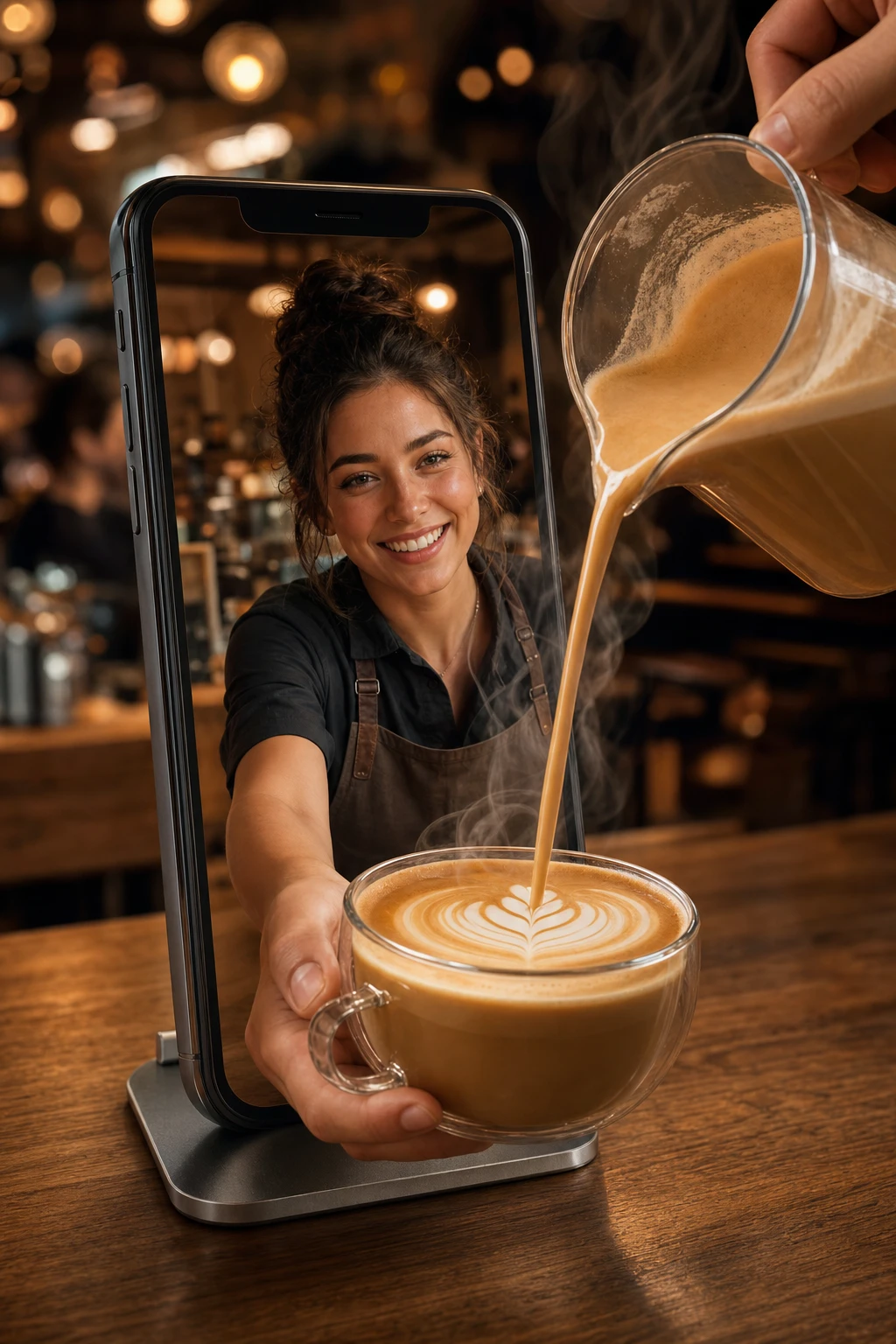
Pattern 2 — The hand-reach moment
A disembodied hand reaching into the frame to grab the food. A finger pulling a strand of cheese from a pizza slice. A palm cupping a takeaway cup as it lifts off a counter. A hand tearing a piece of bread. The hand is anonymous — no face, no identity — because the customer's brain inserts their own hand into the frame.
This pattern is appetite-cue biology. Cognitive research on advertising imagery has established that food shots showing a "first-person" hand reaching toward the product increase purchase intent versus the same shot without the hand. It scales across the entire region because there is no cultural or regional gate on it. A hand reaching for a shawarma works in Tangier, in Tripoli, in Tabuk. A hand pouring saffron rice from a pan works in Manama, in Mosul, in Mahdia. The constraint is light hygiene (no visible nail dirt, no overly hairy forearm, no jewellery that brand-clashes) and angle (the hand should enter from the side or the bottom, never the top — top-entry hands break the top-down hero plate pattern from #1).
For a small juice bar in Jeddah or a falafel shop in Alexandria, the hand-reach is the cheapest single-shot upgrade available. Pre-AI, you would hire a hand model and a photographer for 4,000 riyals to shoot ten variations. Today, you describe the moment to Memm with the dish reference and ship five variations in an evening.
Pattern 3 — Steam as protagonist
Rice with visible steam rising from the bowl. Soup with curling vapour above the surface. Lentil koshary with heat shimmer over the top layer. Mint tea with steam crowning the glass. The steam is not a garnish — it is the headline. It says "this was alive thirty seconds before you opened the app."
The discipline lives in colour temperature. Warm 3000-3500K lighting for any steam shot — never cool. Cool fluorescent light on a steam-rising dish reads as "leftover, kept warm under a heat lamp." The warm tone is the freshness signal; the steam is the freshness proof; together they bypass the customer's "is this from a microwave?" suspicion that kills 30% of food-delivery conversion intent.
The anti-pattern: cold-toned plating that looks beautiful on Instagram and earns zero orders. A cold blue-grey lit bowl of lentil soup on a slate surface is the Pinterest aesthetic that drives saves, not orders. Saves are an ego metric. Orders pay rent.
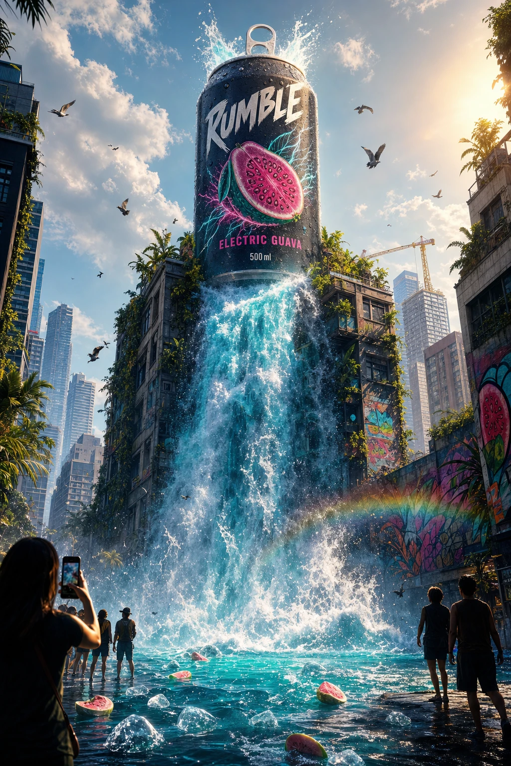
The RUMBLE frame above demonstrates the warm-tone discipline at billboard scale: the entire colour story is in the 3000-3200K range and the visual energy reads as "active, hot, now." Same colour discipline applied to a bowl of koshary or a plate of mansaf is the difference between a 1.8% delivery-app conversion and a 4.3% one.
Pattern 4 — The bilingual-headline-above-plate format
Arabic headline carries the idea. English supporting line carries the brand or the qualifier. 70/30 visual weight in favour of Arabic. The headline sits above or beside the hero plate, never on top of it (text over food in restaurant ads almost always destroys the appetite cue).
This format is the workhorse of every cross-market QSR entering MENA — KFC, Albaik in its post-2018 international rebrand (Albaik International Expansion Case Study), Pizza Hut, McDonald's. It works because the Arabic-dominant register signals "this is for you, locally" while the English line provides the brand anchor and reassures cross-mall expat readers. The 70/30 weight is non-negotiable: equal-weight bilingual reads as a translation file, not a designed ad.
Albaik's brand identity work is a textbook case of getting this right. King-Casey rebuilt the Albaik visual system in the late 2010s ahead of its UAE expansion, locking an Arabic-dominant register across packaging, signage, and ad creative while preserving the English wordmark as a secondary anchor. The same insight scales: a single Egyptian foul-and-falafel shop opening a second branch in the UAE Mall of the Emirates food court can apply the same 70/30 rule on its delivery hero in an afternoon with Memm, instead of paying an agency 35,000 dirhams for a brand-bilingualization sprint.
Pattern 5 — The pricing-led card for value-tier delivery
A bold price stamped on the visual. "25 ر.س" in a contrasting badge. "12 ج.م" on an Egyptian koshary box. "8 د.ج" on an Algerian shawarma combo. The price is the headline, the plate is the proof.
This pattern is mandatory for value-tier delivery because the data is unambiguous. NielsenIQ Gulf research shows that temporary price reductions account for 86% of purchase-driving deals in Saudi and 56% in the UAE (NielsenIQ Best Practices in Pricing & Promotion for FMCG in the Gulf, 2025). The Saudi shopper is responding to a price cue more aggressively than the UAE shopper, but in both markets price-led creative outperforms brand-led creative on the value-tier menu by a wide margin.
Three rules that hold pan-Arab on the pricing-led card:
- Western numerals only — 25, never the Eastern Arabic digit form. Recognition is faster at glance speed across every Arab market, and modern Arabic ad design has standardized on this for two decades.
- Currency symbol after the number, in Arabic-dominant cards — "25 ر.س" not "ر.س 25", because the RTL reading flow lands the eye on the number first.
- Price in a contrasting badge or circle, not in body weight on the plate — the badge is what survives the 320-pixel thumbnail crop on a phone.
For a small shawarma shop in Sharjah running a "Two for 25 dirhams" lunch promo, the pricing-led card is the highest-leverage single creative you can ship. Pre-AI, this meant a graphic designer at 800 dirhams per asset turning out four variations. Today, the same owner ships eight variations in an evening, A/B tests two on each daypart, and keeps the winner.
Pattern 6 — The ingredient-as-art shot
A handful of saffron strands on dark slate. Mint leaves with water droplets. Ground cumin in a small wooden bowl. Whole cardamom pods spilling from a brass spoon. The hero is not the dish — it's the single ingredient that signals "we use real ones."
This pattern is for the premium tier — fine dining, single-origin spice brands, "real cooking" QSR-disruptors trying to position against the cheap-frozen mass market. It is the visual equivalent of a chef walking out and naming the farm. Almarai built its 33% Saudi dairy market share (Almarai HBS Case Study) partly on a creative system that gave the ingredient (real Saudi milk) the hero treatment alongside the final product. The same insight scales: a single mandi house in Riyadh positioning itself against the value-tier delivery competition can shoot the saffron, the cardamom, the Hassawi rice as ingredient-as-art heroes for one campaign cycle and signal "fine dining at delivery price" without ever using the word "premium."
The rule on ingredient-as-art: shoot it as a portrait of the ingredient, not a documentation shot. Shallow depth of field, dramatic side light, the ingredient lifted slightly above the surface or caught mid-fall. A flat top-down shot of cumin in a measuring cup is not this pattern. A close, dimensional, slightly cinematic shot of cumin spilling from a wooden spoon is.
The seventh failure — what kills restaurant ads pan-Arab
The six patterns above describe what works. The seventh section names what reliably fails, and it fails in every Arab market identically. Five anti-patterns to delete from your creative library:
- Cluttered collage layouts — six dishes shown in a single tile, each at 16% of the frame. The customer's eye has nowhere to land. Collage was a 2015 Facebook-ad pattern that has aged into disrespect.
- White-background cutout product photos — a chicken dish floating on pure white reads as 2017 stock photography and signals "cheap mass-market chain." Outside the e-commerce-aesthetic frame, white-bg cutouts are dead for restaurant heroes.
- Random emoji overlays — fire emojis stamped on a steaming bowl of soup, a kiss-mark on a dessert. Emojis on the visual itself (not in the caption) signal "amateur" across every age group above 19. They survive only on TikTok in-feed creator content, not in paid ad heroes.
- Mismatched fonts in the same headline — Arabic in Naveid ExtraBold, English supporting line in Comic Sans or in a different serif altogether. Junior designers do this when they do not have a paired bilingual type system. The fix: pair Naveid Arabic with a neutral Latin sans (Inter, Manrope, Helvetica). Never mix three or more typefaces in a single ad frame.
- Low-contrast price and CTA — a 25 ر.س in light grey on a warm-toned plate background. The price disappears at thumbnail scale. The order button reads as decorative. The whole pricing-led pattern collapses. Fix: high-contrast badge, dark text on bright fill or bright text on dark fill, always.
Country-by-country adaptations
The six patterns are the base layer. Each Arab market has surface tuning that converts higher when respected. Brief notes for the four largest restaurant ad markets:
Saudi Arabia. Bold gold-on-deep-green or red-and-white accents read as locally authentic — they map to the flag, the heritage palette, and the cultural register Saudis recognize. Daypart sensitivity during Ramadan is non-negotiable: pre-Iftar (3-5 PM), Iftar peak (9-11 PM), Suhoor (2-5 AM) each get distinct creative. Snapchat is the dominant social platform — 90.7% of the eligible audience used Snapchat in early 2025 (DataReportal Saudi Arabia 2025) — so your hero plate needs to survive the 9:16 vertical crop and the in-feed Snap Ad's three-second auto-skip. Saudi consumers spend approximately 3 hours and 6 minutes a day on social media (Global Media Insight Saudi Arabia Social Media 2025), and your share of that lives or dies on the first frame.
United Arab Emirates. Bilingual is non-negotiable — the Dubai mixed-expat audience reads English first on roughly 40% of restaurant impressions, Arabic first on the rest. The palette runs cleaner and more premium than Saudi — desaturated, more white space, less heritage-colour-block. Reels and TikTok dominate over Snapchat for food brands; UAE TikTok reach was over 118.5% of the population aged 18+ in early 2025 (Sprinklr Social Media UAE 2025), and short vertical food content under 30 seconds drives the cycle. Carrefour UAE's Reels-led 15-30 second recipe content is the SMB template to study.
Egypt. Aspirational and value-conscious at the same time — the Egyptian middle-class diner wants the visual register of premium but the price of accessible. Koshary, foul, and ta'meya as visual anchors carry inherent cultural recognition; lean on them rather than fighting them with imported aesthetics. Facebook is still dominant among older audiences: Facebook reached approximately 41.4% of the total Egyptian population and 50.5% of internet users in 2025 (DataReportal Egypt 2025), making it the right channel for family-meal and pickup-promo creative aimed at the 30-55 demographic. Instagram Reels and TikTok carry the under-30 audience.
Maghreb (Morocco, Algeria, Tunisia). French-Arabic typography pairing is the regional default — your bilingual hierarchy works at 50/50 weight here, not 70/30, because both languages share readership. Mediterranean light palette (sun-bleached whites, soft terracotta, olive green) reads more authentic than Gulf gold-and-green. Facebook and Instagram are roughly balanced in volume; Glovo dominates delivery across all three markets (Food Business Africa Glovo Africa). Local currency formatting matters: "8 د.ج" in Algiers, "35 د.م" in Casablanca, "12 د.ت" in Tunis — never substitute a generic dollar sign or generic Arabic-Gulf currency.
The takeaway
Six visual patterns drive restaurant orders across the entire Arab market: the top-down hero plate, the hand-reach moment, the steam-as-protagonist warm-food shot, the bilingual headline above the plate, the pricing-led card for value-tier delivery, and the ingredient-as-art shot for premium. One anti-pattern category — cluttered collages, white-bg cutouts, emoji overlays, mismatched fonts, low-contrast pricing — reliably kills conversion. Four country-level tuning notes (Saudi gold-and-Snapchat, UAE clean-bilingual-and-Reels, Egypt foul-and-Facebook, Maghreb French-Arabic-and-Glovo) sit on top of the base layer.
Pre-AI, applying all six patterns across a 30-day campaign cycle meant a 22,000-dirham agency retainer, a food photographer, a stylist, and three weeks of pre-production. Today, a single-restaurant owner with reference photos shot on a phone near a window can ship the entire system through Memm (ميم) in an afternoon — pattern-correct heroes, country-tuned palettes, bilingual headlines that read native, and pricing cards that survive the 320-pixel thumbnail crop. The craft moves from the photographer to you.
CTA
Browse the food and beverage design collection on Memm, pick a pattern that matches your kitchen, and open Memm to ship your first hero in under ten minutes. For the Arabic-first companion piece, see our guide on restaurant ad design in Saudi Arabia. For the delivery-platform-specific playbook on HungerStation and Talabat, see restaurant ad design for HungerStation and Talabat. When you are ready for unlimited generations and campaign-grade exports, Memm's pricing starts at a fraction of an agency retainer.
Memm helps create the visual concept, product styling, and campaign direction. For exact logo placement, brand fonts, and final production edits, you can finish the design in Canva, Figma, Photoshop, or your preferred design tool.
Sources
- Albaik International Expansion to UAE — SAGE Journals (2024)
- Almarai HBS Case Study
- Cognitive Market Research — MENA Food Delivery Market 2025
- DataReportal — Digital 2025: Egypt
- DataReportal — Digital 2025: Saudi Arabia
- Food Business Africa — Glovo Africa Expansion
- Global Media Insight — Saudi Arabia Social Media Statistics 2025
- IMARC Group — Egypt Online Food Delivery Market 2025
- Mordor Intelligence — Saudi Arabia Delivery Apps Market 2025
- NielsenIQ — Best Practices in Pricing & Promotion for FMCG in the Gulf (2025)
- Sprinklr — Social Media in UAE 2025
- VML — Birthmark Stories for HungerStation (Effie MENA Gold + Dubai Lynx Grand Prix 2024)
Try this in Memm
Make a campaign like this in seconds.
Generate Arabic and bilingual ad visuals from your product photos — no design experience needed.
Open in MemmKeep reading
food-beverage
تصميم إعلان كافيه ومخبز عربي: من المنيو إلى لوحة العرض
الفرق بين إعلان مقهى يبيع فعلاً وإعلان مقهى «شكليّ» يكمن في ثلاثة قرارات تصميمية، تُتّخذ كلّها على نحو خاطئ.
7 min readfood-beverage
Burger Joint Instagram Ads in the GCC: Why 'Smash' Beats 'Gourmet'
The visual language of a fast-casual burger chain in Riyadh or Dubai isn't the same as a fine-dining steakhouse. Here's how to tell them apart in your creative.
10 min readfood-beverage
تصميم إعلان مطعم محلي في السعودية: قواعد التصوير والنسب
دليل عملي لصاحب المطعم المحلي في الرياض وجدة والدمام — ست أنماط بصرية تعمل، ونسب لكل منصّة، وقرارات تصوير وألوان وخط عربي قبل أن تفتح أداة التصميم.
8 min read