How to design an Arabic Instagram ad that actually converts in MENA
The pan-regional typography, color, and headline craft that separates an Arabic Instagram ad that earns the scroll-stop from one that gets thumb-flicked past.
From the Memm Editorial Team
Original guides on Arabic ad design, MENA campaign strategy, and bilingual creative direction.
How to design an Arabic Instagram ad that actually converts in MENA
The pan-regional typography, color, and headline craft that separates an Arabic Instagram ad that earns the scroll-stop from one that gets thumb-flicked past.
Your Arabic ad got 4 saves and you can't tell why
You uploaded the post on Sunday after Asr. The bottle of serum on a marble surface, soft window light, a perfectly clean Arabic headline you wrote yourself: "بشرة نقية في 14 يوم." The English line underneath, "Clean skin in 14 days." Your Memm-built key visual, your wordmark in the corner, your phone number bottom-left. You promoted it for $60 across Saudi, UAE, and Egypt and waited.
Four saves. Two link clicks. No purchases.
The reflex is to blame the algorithm or the audience. Almost always wrong. The post-mortem on a flat-performing Arabic Instagram ad in 2026 lives in five places — typography, language commitment, color choice, headline length, and aspect ratio — and most independents lose the campaign in the first two. This article is the design conversation a senior MENA strategist would have had with you before you spent that $60. If you sell into Saudi, UAE, Egypt, the Levant, or the Maghreb on Instagram, Memm (ميم) helps you ship the visual and tunes the regional register; the craft below is what you bring to the brief.
Why Arabic Instagram is a craft problem, not a budget problem
Instagram had 19.7 million active users in Saudi Arabia alone in March 2026 (NapoleonCat, March 2026), and short-form video drives roughly 80% of social traffic in the Kingdom (Communicate Online, MENA Creator Commerce 2025). Across MENA the digital ad market grew through 2025–2026 to roughly $7 billion, with paid social claiming the dominant share (Statista MENA Digital Advertising Outlook 2026). The audience is there. The spend is there. The bottleneck is craft.
Specifically, Arabic-typography craft. Naveid Studio's own audit of Arabic display typography found that the bulk of consumer-facing Arabic ad creative in the region uses fonts at weights and line-spacing values that were optimised for English (Naveid Type Foundry, Arabic typography notes). A Riyadh design team that has only worked in Latin doesn't know that 1.2 line-height — which is the safe default in English — strangles Arabic readability. The result is a feed full of ads that read fine to a designer at 24-inch monitor distance and become illegible the moment they hit a phone at thumb scroll.
The good news: the gap is closeable in an afternoon. Senior MENA strategists at agencies like Memac Ogilvy and TBWA\Raad enforce eight or nine specific Arabic-typography disciplines on every brief. If you apply them, your $60 buys orders. If you don't, it buys saves.
Rule 1 — Line-height is 1.4 to 1.6 for Arabic, not 1.2
This is the single highest-leverage typography decision in an Arabic Instagram ad, and it is the most consistent unforced error in MENA SMB creative.
Latin typography survives tight line-height because letters sit between a baseline and an x-height with very little vertical extension. Arabic does not behave that way. Arabic glyphs ascend high (the alif, the lam, the kaf) and descend low (the yaa, the dal's tail in some fonts), and they carry dots above and below the baseline. At 1.2 line-height — the English default — the descenders of one line crash into the ascenders of the next, and the diacritical dots (nuqat) merge into a visual mess. The ad doesn't look "wrong" to a non-Arab eye. It just doesn't read.
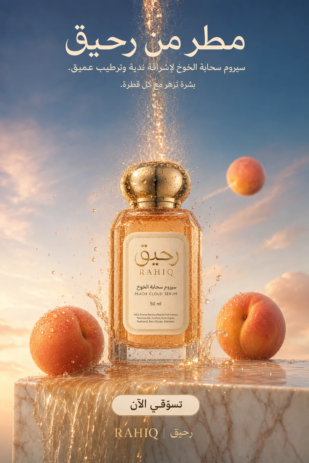
The discipline: when an Arabic headline runs two lines or more, set line-height between 1.4 and 1.6. Tighter than that for display-weight Arabic on small screens is an active conversion killer. The Arabic line under your bottle of serum at 1.2 is what's costing you the save.
The RAHIQ visual above is built exactly to this rule: the Arabic headline runs across multiple lines with generous vertical breathing, and at 320-pixel thumbnail width every word survives. A junior designer would have compressed that line-spacing to "fit more product on the page" and erased the readability that earns the stop.
Rule 2 — Kerning that survives the 320px crop
Instagram's feed thumbnail on a typical Android phone in MENA renders at roughly 320 pixels wide. Your masterful 1080×1350 key visual gets downsampled to that — sometimes lower on a 2018-era Samsung still common across Egypt and the Levant. If your Arabic headline isn't legible at that width, the algorithm never gets to find out whether the rest of the ad would have worked.
The kerning rule, scaled from the senior MENA art director's playbook for Saudi OOH (Media.co.uk Riyadh Billboard Times) where panels get a 3-second glance at speed: open up letter-spacing on the headline weight slightly tighter than default for connected scripts. Most Arabic typefaces — Naveid, Cairo, Tajawal — ship with kerning tables tuned for body copy at 14–18 pixels. At display-weight 80+ pixels on a poster, the default kerning is correct. At display-weight on a phone screen downsampled to 320 pixels, it slightly under-spaces. The fix is a 2–5% letter-spacing increase on the display headline, never more, never less — and never apply it to body copy.
A second-order rule: never use Naveid or Cairo at weight 400 (Regular) on a dark background. The strokes get eaten by the contrast at thumbnail size. Use weight 700+ or shift to a heavier display cut. The single most common Arabic Instagram typography fail in 2026 is "weight 400 white text on a dark warm background, downsampled to phone" — illegible roughly 80% of the time at thumb scroll distance.
Rule 3 — The diacritics decision: ship shadda only when meaning depends on it
Arabic diacritical marks (tashkeel — fatha, kasra, damma, shadda, sukun) are a strategic choice on a key visual, not a default. The instinct of a junior Arabic copywriter is to add them everywhere — for "correctness." That instinct produces ads where the diacritical dots stack against the Latin product label or the Western numeral, creating visual noise that downsamples to mud.
The discipline a senior copywriter applies: ship diacritical marks only where the meaning actually depends on them. The shadda on a doubled consonant that disambiguates a word, yes. The fatha that confirms a verb's tense in a tagline, occasionally. The full tashkeel on every word of a four-word headline, no — that's a Quran-style register, and unless you're a religious-content brand, it reads wrong.

The NIMR DERM frame above is a controlled example. The shadda on "نِمْر" (the brand name) is deliberate — it disambiguates the word and locks the brand pronunciation. The rest of the typography stays clean. A junior designer would have added kasras and fathas across the whole supporting line "for premium feel" and would have killed the visual hierarchy in the process.
Rule 4 — Commit to one language per line, then weight a 70/30 hierarchy
The most common bilingual-handling mistake in MENA Instagram ads is putting Arabic and English on the same line in the same weight, "to be safe." The eye reads left-to-right for the English half and right-to-left for the Arabic half — the visual hierarchy collapses. A senior MENA copywriter never does this (ALTA Language Services — 10 Marketing Translation Fails).
The decision is binary: which language carries the idea, and which language is the support. For a Saudi-only premium brand, the answer is almost always Arabic-dominant, with a small English line that reads more as a wordmark anchor than as a translation. For a UAE retail brand selling to mixed expat audiences in Dubai Mall, the answer flips — English-dominant headline, Arabic supporting line, both transcreated (never machine-translated). For a brand running cross-MENA — food, fashion, beauty, F&B — bilingual at a 70/30 visual weight is correct, but the dominant 70% should still commit to one register, and the 30% should never compete with it for the viewer's eye.
The 70/30 hierarchy translates concretely as: dominant headline at one weight (say, 900/ExtraBold), supporting line at a substantially lighter weight (400/Regular) and 60–70% of the dominant size. Same line is acceptable when the two languages share a center anchor (a centered logo lockup) and neither tries to be the headline. Same line is wrong when both are doing the work of saying the same thing twice.
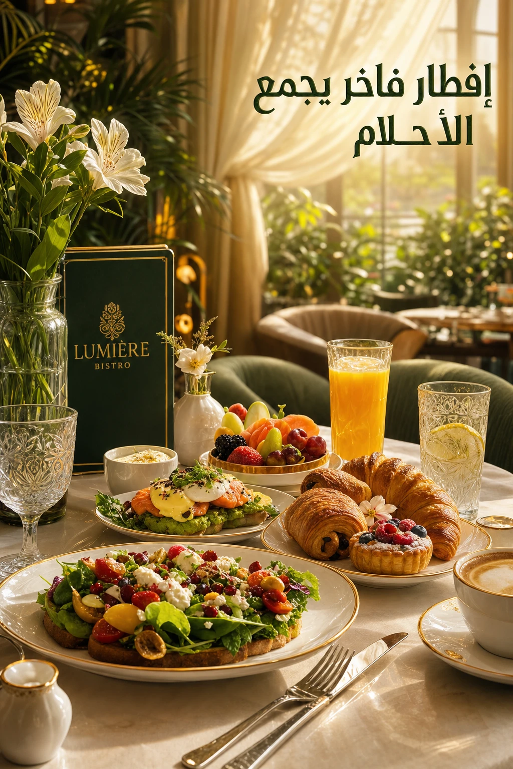
Lumière Bistro above is doing the bilingual handshake well: there's a clearly dominant typographic anchor, and the supporting language doesn't compete for the eye. It works because someone made a decision instead of avoiding one.
Rule 5 — The Arabic-headline 5-word rule (scaled from the billboard)
The 5-word rule comes from senior MENA OOH art directors holding billboards to a brutal discipline: if a headline can't be read in five words or fewer at speed, it's a poster, not a billboard (Media.co.uk Riyadh Billboard Times, 2024). The rule scales almost perfectly to Instagram, with one important MENA-specific adjustment.
Arabic is denser per pixel than English equivalents. The same idea expressed in Arabic typically runs 15–25% shorter in character count than its English transcreation, because Arabic morphology fuses prefixes, suffixes, and pronoun-attached possessives into single words ("بشرتك" = "your skin" — one word in Arabic, two in English). At first glance this sounds like Arabic gets more room — actually the opposite is true on a key visual. Arabic words tend to be taller per glyph and require more vertical space per character once line-spacing is corrected to Rule 1's 1.4–1.6 standard.
The practical implication: a five-word Arabic headline often reads as visually busier than its English counterpart. Senior MENA copywriters drop the English five-word target by one when writing the Arabic side — they aim for four. "Smell expensive for SAR 95" (5 words) often transcreates to "تعطّر بفخامة بـ95 ريال" (4 words) in Khaleeji register, and lands cleaner on the page.
Rule 6 — The MENA color audit: gold pan-regional, red category-specific, pastel regional
Color in MENA Instagram ads is not a single conversation. The same hue carries different meanings across the region, and an SMB owner running one creative across Saudi, UAE, Egypt, and the Levant is shipping four different ads' worth of perception in one file.
Gold pans the region cleanly. Across Khaleeji, Egyptian, Levantine, and Maghrebi registers, gold consistently reads premium — it is the most portable color choice for a regional luxury campaign. Saudi gold demand of 11.5 tonnes in Q1 2025, up 35% year on year (World Gold Council Q1 2025), is partly a function of how deeply gold codes premium across the entire Arabic-speaking population.
Red is category-specific. In food, red triggers appetite — every regional QSR brand from Albaik to Kudu to Herfy uses warm red prominently. In e-commerce promotional banners, the same red reads as "cheap clearance," and overuse on Instagram trains your audience that your brand is a discount brand even when you're not running a discount. The rule: warm-red is correct for food and entertainment categories, dangerous for beauty and apparel.
Pastels read regionally. A soft pink for a beauty product reads differently across the region. In the Gulf — Saudi, UAE, Qatar — pale pinks and lavenders read clinical and pharmacy-coded; they are a strong choice for skincare positioned as dermatologist-grade. In the Levant — Jordan, Lebanon, Syria — the same pastels read soft, romantic, and warm; they work for editorial beauty and lifestyle. In the Maghreb — Morocco, Tunisia, Algeria — pastel palettes carry a Mediterranean-light association and connect better to outdoor/sun/Mediterranean-coast positioning. One pastel, three different reads. The implication for cross-regional Instagram campaigns: localise the color cuts even when the product photography is identical.
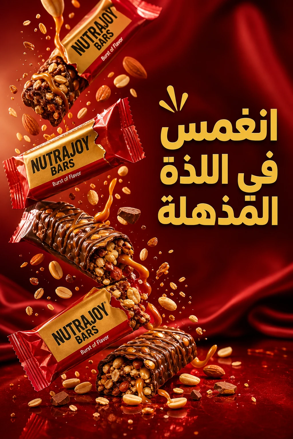
The NUTRAJOY frame above demonstrates the category-color logic in the other direction: a healthy-snack consumer-goods ad uses saturated greens and warm tones because the food category gives it permission to. The same palette on a luxury beauty brand would read amateur.
Rule 7 — Aspect ratio: 4:5 for feed, 9:16 for Reels and Stories, no exceptions
Instagram's organic feed surface in 2026 rewards 4:5 (1080×1350) over 1:1 (1080×1080) by roughly 25–30% in feed hold time across short-form image ads, because the taller crop occupies more screen real estate on mobile and intercepts the scroll for longer. Reels and Stories take 9:16 (1080×1920) exclusively — and Reels deliver roughly 1.3× the conversion rate of comparable static placements for MENA e-commerce brands (Loopex Digital, Instagram Reels Statistics 2026).
The 1:1 square is no longer a primary ratio in 2026. It survives as a profile-grid format. Designing your campaign primary key visual at 1:1 means you are crop-locking yourself to a 25% screen-share disadvantage in the surface where most of your impressions actually live. The 16:9 landscape ratio is functionally dead for Instagram organic and paid alike — keep it for YouTube pre-roll or LinkedIn, never for Instagram.
The practical workflow for a single-product SMB: design at 9:16 first (1080×1920), with all the critical typography in the middle 65% of the canvas (top 15% gets blocked by username, bottom 20% by caption and CTA). Then crop to 4:5 (1080×1350) for the feed variant — the same hierarchy holds. A 1:1 fallback is generated last, only as a profile-grid asset, not as a paid-ad creative.
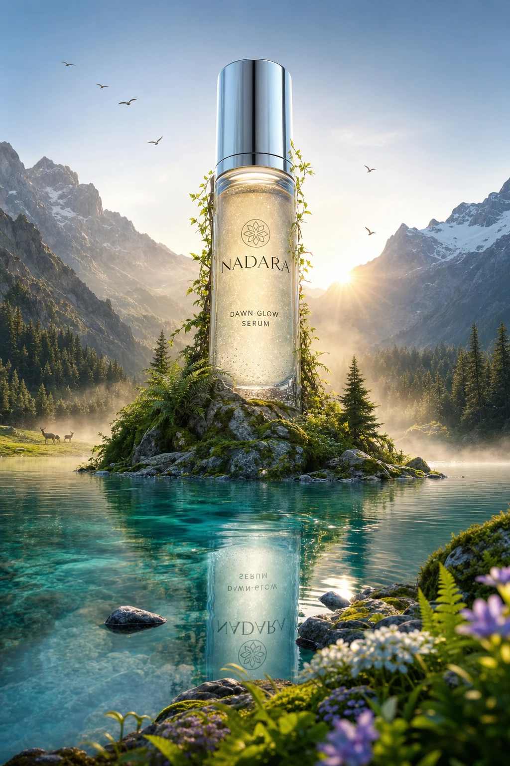
The NADARA frame above is built at the 4:5 ratio with safe-zone discipline that lets it crop both up to 9:16 and down to 1:1 without losing the typographic anchor. That kind of single-decision file saves you from generating three separate creatives per concept.
Rule 8 — Premium register: when single-language Arabic out-performs bilingual
The hardest pattern for a small brand to internalise is that more language is not more reach. For Saudi-only luxury campaigns — premium perfume, jewelry, high-end abaya, dermatologist-grade skincare — a single-language Arabic key visual consistently out-performs the bilingual version. The reason is registerial: an Arabic-only premium ad signals "this brand is confident, native, and not chasing the expat market." The bilingual version signals "this brand wants the broadest possible audience" — which in the luxury category is often the wrong signal.
The Vespera Haute Joaillerie frame above is committed: cool architectural light, restrained palette, brand mark and language all working in one register. That commitment is what a Damas or Mouawad creative director would defend in a brief review. A nervous junior creative would have added an English supporting line "for international audiences" and would have erased the premium signal in the process.
For SMB owners operating on $200–$2,000/month: if your product positions premium and your primary market is Saudi or UAE-Khaleeji, commit to Arabic-only on at least 50% of your Instagram creative output. The other 50% can run bilingual. Watch the save rate. The Arabic-only variants will usually win on save rate even when the bilingual variants win on impressions — saves are the higher-intent signal for a premium category.
The Riyadh-saturation paradox — why the bar is higher than agencies think
Saudi Arabia has the world's highest Snapchat penetration at 76.5% of the population and one of the highest Instagram penetrations in MENA (Statista — Leading Snapchat markets, April 2024; DataReportal Digital Saudi Arabia 2025). 90% of Saudis aged 13–34 use Snapchat, opening it on average 50 times a day (Zawya / Arab News, 2024). Instagram engagement runs in parallel.
The implication that most regional agencies misread: a market that scrolls this much educates itself faster than its brands do. The average Saudi 24-year-old has seen more Cartier, Prada, and Tom Ford key visuals on her phone in 2025 than a London art-school graduate sees in a year. She knows what premium looks like. She knows what cheap looks like. And she knows — within 1.7 seconds of a scroll — which one your ad is.
This collapses the old MENA agency comfort that "the audience isn't that demanding yet." The audience is more demanding than the agencies. The brands that win in the next 24 months on Arabic Instagram are the brands that operate with the same craft discipline a Damas, a Bvlgari MENA, or a Visit Saudi creative director enforces — not the brands that scale up middle-of-the-bell-curve work.
The shift: what an Arabic Instagram ad costs to ship now
A decade ago, the eight rules above were the territory of an agency retainer. A senior Arabic copywriter in Riyadh or Dubai cost more per day than a small salon's monthly ad budget. The typographer who actually understood Naveid's kerning tables charged $400–$800 a project. The art director who could enforce the 70/30 bilingual hierarchy was a $200K-a-year hire at TBWA\Raad or Memac Ogilvy. The single-restaurant owner in Jeddah, the single-brand founder selling perfume on Salla, the Beirut accessories seller — none of them could realistically buy that craft.
Today an SMB owner can brief, generate, and ship a typography-aware Arabic Instagram ad in a single afternoon with Memm. The product photo and a single sentence of intent generates a key visual that already respects the line-height rule, the kerning rule, the diacritics decision, and the language-commitment hierarchy. The strategic decisions in this article — which register, which color reading for which region, which aspect ratio — still belong to you. The production craft layer doesn't.
Takeaway
An Arabic Instagram ad that converts in MENA in 2026 is the intersection of eight small typographic and strategic decisions: 1.4–1.6 line-height, kerning that survives 320-pixel downsample, selective diacritics only where meaning depends, one committed language per line at 70/30 weighting, a four-word Arabic headline target, color choices tuned by region and category, 4:5 and 9:16 as primary ratios, and a willingness to ship single-language Arabic in premium categories. None of these requires an agency. All of them require the conviction to commit to a register and a hierarchy instead of hedging. The brands that win the next year on Arabic Instagram will be the small ones that operate like Damas creative directors — because for the first time, the tools let them.
For the Arabic-language companion guide written for restaurant owners in Saudi Arabia, see تصميم إعلان مطعم محلي في السعودية. For the food-delivery platform variant of this craft, see Restaurant Ad Design for HungerStation and Talabat.
Try this brief in Memm
Open Memm, upload your hero product photo, and tell the agent: "Design three Arabic Instagram ad variants for my [product] — one Saudi-only single-language Arabic in Khaleeji premium register, one UAE bilingual at 70/30, one cross-MENA gold-dominant palette. Vertical 9:16 with safe-zone discipline." Memm helps create the visual concept, product styling, and campaign direction. For exact logo placement, brand fonts, and final production edits, you can finish the design in Canva, Figma, Photoshop, or your preferred design tool.
Discover designs → · Browse beauty designs → · Open Memm → · See pricing →
Sources
- ALTA Language Services — 10 Marketing Translation Fails
- Communicate Online — Reach to Revenue: Rise of Creator Commerce in MENA, 2025
- DataReportal — Digital 2025 Saudi Arabia
- Loopex Digital — Instagram Reels Statistics 2026
- Media.co.uk — Capital City Mega Traffic: Riyadh Billboard Times, 2024
- NapoleonCat — Instagram Users in Saudi Arabia, March 2026
- Naveid Type Foundry — Arabic typography notes
- Snap Inc. via Zawya — Snapchat 25M Saudi monthly users
- Statista — Leading Snapchat markets (Saudi #1, April 2024)
- Statista — MENA Digital Advertising Outlook 2026
- World Gold Council — Gold Demand Trends Q1 2025: Jewellery
Try this in Memm
Make a campaign like this in seconds.
Generate Arabic and bilingual ad visuals from your product photos — no design experience needed.
Open in MemmKeep reading
beauty-cosmetics
Serum vs Cream: Which Hero Composition Sells Faster on Instagram
A serum ad and a cream ad need different hero compositions. Here's how to shoot (or generate) each one so it converts.
11 min readbeauty-cosmetics
كيف تصمم إعلان عطر فاخر يبيع: 7 قواعد بصرية للسوق الخليجي
سبع قواعد بصرية يحسمها صاحب علامة العطور الصغيرة قبل أن يفتح أداة التصميم — حتى لا تخرج زجاجته بمظهر صيدلية بميزانية إعلانية محدودة.
9 min read